The Expression Agenda (XpA) was just released by Article19. It’s rather prettier than most metrics, and nice to see free expression data in something other than a map or a list; but really, do we need this?
There are, after all, already a host of comparable comparative indices. There’s RSF’s Press Freedom Index, CPJ’s indices of journalists killed, IREX’s Media Sustainability Index, Freedom House’s Freedom of the Press and Freedom on the Net, plus a host of indices on civic space and democratic governance that incorporate freedom of expression as a core component. In fact, all XpA is pulled from the V-Dem data set. So why?
We hope that this metric, to be published annually, helps galvanise action at the global, regional, and national level to protect freedom of expression for future generations.
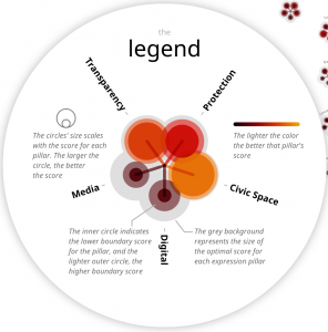
The metric is supported by a 36 page report, which is likely what Article19 hopes will do the real leg work for galvanizing action. The flashy visualization and metric are just likely attention grabbers. After all, the report has useful analysis and describes disturbing trends according to each of the “five defining elements” of the XpA metric (civic space, digital, media, transparency, protection). That’s important, but grouping indicators and analyzing them is analysis of existing data, it’s not a metric.
Pushing this as a metric with a colorful visualization at the helm is a little worse than 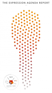 burying the lead, because the metric and visualization aren’t themselves very useful. At first glance, the fiery ice cream cone suggests a lot of good practice up top with a few stragglers, but a closer look suggests this might not be accurate.
The individual country flowers seem to be an aesthetic update to the spider diagrams CIVICUS took so much heat for a decade ago. But they suffer from the same problem of demanding a lot of cognitive work, and don’t have any numbers, using a heat-map style color shades to add to the cognitive burden.
Some in-country actors might like this. Maybe someone in Sierra Leone will look at their country’s flower and feel vindicated, say, “yeah, civic space should be a slightly darker orange than transparency or media.” But it’s not clear how this is useful for their work. For use in national advocacy, you still have to dig into the underlying data, which was already available from V-Dem. For comparative analysis, I’ve got nothing here. You want to compare Sierra Leone to other countries? Go ahead and try to find the Sierra Leone flower in the ice cream cone, I dare you.
 It might be interesting to have a more useful re-mash of existing data on freedom of expression for understanding global trends or supporting advocacy. But this metric falls short. It’s impossible to spot any trends within the “five defining elements” that XpA highlights, and almost impossible to make sense of what is going on in the world generally. What’s worse, the index misses out on the one advantage of boring lists: they motivate countries to do better.
This metric is kind of pretty at first glance, and everybody wants to be on the side of press freedom, so I’m sure it will get shared and bandied. But it’s not entirely clear what it’s for. The report lurking in the background is more important by far, and should get top billing, where it might be useful for convincing global actors and policy makers that freedom of expression is indeed in troubling decline. The ice cream cone doesn’t get us there, just takes up a lot of RSS space. Article19 and V-Dem are both amazing institutions. I hope to see a lot more useful stuff coming out of their collaboration.